The key is to use light, reflective colours. Bright neutrals like white, cream, pale grey or soft beige make fences appear to melt away by bouncing sunlight around. A glossy white fence, for example, “reflects more light than other colours” and can “create the impression of more space”. In contrast, very dark matte colours (black, charcoal, deep green) can also enlarge the look of your garden by receding into shadow: experts explain that black is almost “recessive” – our eyes barely register it, so the fence line seems to vanish and your plants take centre stage. In short, paint your fence a light, airy hue (or a non-reflective dark) to open up a small space.
Light and Neutral Colors
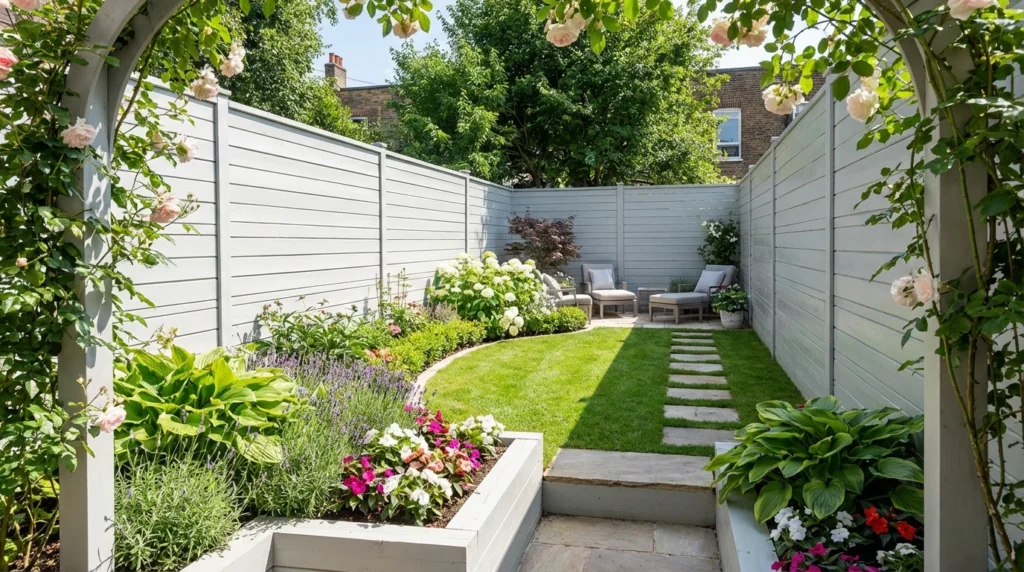
Light colours are the easiest way to make a garden feel more open. Shades like white, cream or pale grey reflect sunlight, brightening the space and softening edges. For example, painting a fence off-white gave one designer a “bright backdrop that made the landscape’s colours stand out,” even as it made the garden look more expansive. Similarly, soft taupe or warm beige fences offer a gentle, natural look while still opening up the space. These neutrals blur the boundary between fence and sky, so the fence doesn’t feel like a hard edge. In practice, a light grey fence “softens and blurs the frame of your garden,” making it appear much bigger.
- White, Cream or Pale Grey: Highly reflective colours. They bounce sunlight into shadowy corners, making the garden feel bright and vast.
- Soft Beige or Taupe: Warm neutrals that complement stone and plants. They create a lived-in, natural look without shrinking the space.
Soft Pastels and Calming Hues
Light pastel hues can also expand your outdoor space. Think of a sky-blue or lavender fence – it mimics the distant sky and horizon, tricking the eye into seeing more depth. Such colours make the garden feel open and serene (one designer even notes pale blue “evokes vast, open spaces”). Likewise, minty green, soft sage or pale pistachio fences blend into surrounding foliage. By adding green to the fence, you effectively extend the garden further out and make the boundaries less noticeable. Even a gentle pink can help: in morning or evening light a pale pink fence “glows,” giving a small backyard a larger feel under soft dawn or sunset hues.
- Pale Blue & Lavender: These sky-like tones open up the view, making the fence recede into the distance.
- Soft Green (Mint, Sage): A very light green fence becomes one with the plants, creating a seamless, continuous feel.
- Soft Pink: In full sun, a pale pink fence can appear to vanish in the rosy light, subtly expanding the space.
Dark and Recessive Colours
It may seem counterintuitive, but very dark paint can also make a garden look bigger by hiding the fence in shadow. Matte black or charcoal fences act as a “recessive” backdrop – our eyes don’t focus on them, so the fence line seems to fade away. This makes the greenery and sky pop in comparison. Similarly, deep forest green or navy blue walls blend with the darkest foliage, causing the boundary to disappear into the background. Dark grey is another option: a modern, neutral choice that likewise “dissolves” edges and highlights plant colours.
- Matte Black or Charcoal: These bold shades actually hide the fence from view. The eye focuses on plants and open sky instead, so the garden feels more expansive.
- Deep Green or Navy Blue: Dark earthy tones blend into the surroundings. A dark green fence, for instance, visually continues the garden’s plants into the distance.
- Dark Grey: A sleek, contemporary neutral. It has a similar “boundary-dissolving” effect, making the fence recede and flowers stand out against it.
Tips for Maximizing Space
Beyond colour, there are painting tricks to amplify these illusions:
- Vertical Stripes: Painting thin vertical lines on a fence can make it look taller, drawing the eye upward. (Think of how striped walls make rooms seem higher indoors.)
- Ombre Fade: A gentle gradient – darker paint at the bottom fading to lighter at the top – adds extra height. This technique gives your garden more vertical perspective.
- Monochrome Continuity: Using the same hue for fences, walls and even outdoor furniture creates an unbroken visual flow. A unified colour palette makes the entire area feel cohesive and larger.
- Quality Paint: Choose a good exterior fence paint. A weatherproof, high-quality wood paint not only looks better, but also protects your fence. A fresh, well-maintained paint job will keep colours bright and the space feeling open.
In the end, the best choice depends on your style and your garden. Light shades generally won’t go wrong – they let light flood backyards and make dark corners disappear. But a carefully chosen dark matte paint can also work wonders by turning the fence into a subtle backdrop. Pair your fence colour with the plants you love (light-toned flowers suit pale fences, bold blooms stand out against dark ones) and use design tricks like stripes or ombré to enhance the effect. With the right colour and technique, even a tiny outdoor space can feel surprisingly spacious and inviting.